Master Mixing Prints: Your Ultimate Style Guide
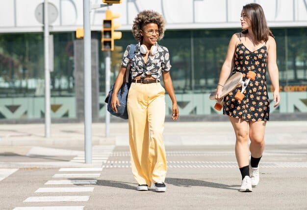
Achieving sartorial excellence through mixed prints involves understanding balance, scale, and color harmony to confidently create cohesive and visually compelling outfits that reflect personal style.
Diving into the world of patterns can feel daunting, but mastering the art of mixing prints is a fashion superpower that transforms ordinary outfits into extraordinary statements. This guide, The Ultimate Guide to Mixing Prints: Create Bold and Stylish Outfits with Confidence, will unlock the secrets to confidently combining patterns, ensuring your wardrobe exudes creativity and flair.
The Foundation: Understanding Print Basics
Before diving into the exciting realm of print mixing, it’s essential to grasp the fundamental characteristics of prints themselves. Each pattern possesses unique qualities that dictate how it interacts with others. Understanding these basics is the bedrock upon which successful print combinations are built, preventing fashion mishaps and fostering a genuinely cohesive aesthetic.
Prints vary widely in their visual impact, from subtle textures to bold, eye-catching graphics. Recognizing these nuances allows for intentional pairing, ensuring that one print doesn’t overpower another, or conversely, that they don’t blend into an uninspired blur. It’s about creating a visual dialogue between different elements, not a shouting match.
Scale Matters: Small, Medium, and Large Prints
One of the most crucial aspects of print mixing is varying the scale. Combining prints of different sizes creates visual interest and prevents an outfit from looking chaotic or overwhelming. Think of it as creating a rhythm with your patterns—a blend of dominant motifs and subtle supporting elements.
- Small Prints: These often act as neutrals, providing a subtle texture. Think dainty polka dots, thin pinstripes, or tiny florals. They are excellent for layering and introducing a hint of pattern without dominating.
- Medium Prints: These sit comfortably in the middle, offering more presence than small prints but less than large ones. A classic plaid or a moderate stripe often falls into this category. They are versatile and can be paired with either smaller or larger patterns.
- Large Prints: These are the statement-makers—bold florals, geometric designs, or abstract art. They demand attention and usually serve as the focal point of an outfit. When incorporating a large print, consider pairing it with something more subdued to maintain balance.
The goal is to create contrast through scale. For example, pairing a wide stripe with a delicate floral can work beautifully because their scales offer a clear distinction, making each pattern pop in its own right while contributing to a harmonious whole. Conversely, combining two prints of very similar scale often leads to a muddled appearance, as neither print gets the opportunity to shine.
Color Harmony: The Unifying Element
While varying print scale is vital, color is arguably the most powerful unifying factor in print mixing. A well-executed mixed-print outfit almost always has a cohesive color story, even if the patterns themselves are wildly different. Color provides the “glue” that binds disparate prints together, making them feel intentional rather than haphazard.
Consider the color palette present in your chosen prints. Do they share a common dominant color, or at least a few complementary hues? For instance, mixing a leopard print with a floral can be successful if both patterns contain shades of brown or black. Similarly, a blue striped top could work with a green botanical skirt if both have a shared underlying cool tone or a pop of a neutral like white.
Neutrals like black, white, gray, and denim are invaluable allies in print mixing. They can act as a bridge between two bold patterns, providing a visual break and grounding the look. A solid neutral piece, such as a black belt, a white t-shirt, or denim jeans, can dilute the intensity of two strong prints and make the overall ensemble more wearable. Ultimately, thoughtful color selection elevates print mixing from chaotic to chic, ensuring your outfit reflects a considered and confident aesthetic.
Starting Simple: Easy Print Combinations for Beginners
For those new to the art of mixing prints, the thought of combining patterns can feel overwhelming. However, starting with simple, classic combinations can build confidence and provide a solid foundation. These beginner-friendly pairings demonstrate how subtle shifts in scale, color, or type can create a coherent and stylish look without venturing into overly complex territory.
The key to these entry-level combinations lies in predictability and contrast. By choosing prints that inherently complement each other or by leveraging a shared element, you minimize the risk and maximize the potential for a chic outcome. It’s about learning the basic rules before you start breaking them with panache.
Stripes and Florals: A Timeless Pairing
The combination of stripes and florals is perhaps one of the most beloved and foolproof in the world of mixed prints. This pairing works so well because it combines two fundamentally different aesthetic categories: the structured, geometric nature of stripes and the organic, flowing beauty of florals. This inherent contrast creates dynamic visual interest.
- Balance Scale: Pair a wider stripe with a daintier floral, or a thin pinstripe with a bolder, larger floral. This variation ensures neither pattern competes too aggressively with the other.
- Harmonize Colors: Ensure at least one color is shared or complementary between the stripe and the floral. A navy and white striped top can look stunning with a floral skirt that prominently features blues, whites, or complementary reds.
- Consider Direction: While less critical, horizontal stripes can provide a grounding effect against the flowing lines of a floral print. Vertical stripes could elongate the silhouette when paired with a more compact floral.
This classic pairing proves that opposites can indeed attract, creating an outfit that feels both fresh and familiar. It’s a versatile combination that can transcend seasons and occasions, depending on the colors and fabrics chosen.
Polka Dots and Stripes: Playful Geometry
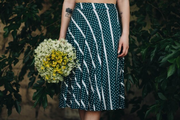
Another excellent entry point into print mixing is the combination of polka dots and stripes. Both are geometric, offering a sense of order, yet their distinct shapes provide enough contrast to make the pairing visually engaging. This duo often evokes a playful, retro, or even nautical vibe, depending on the colors used.
For success with polka dots and stripes, consider maintaining a consistent color palette, often limited to two or three hues. For instance, black and white polka dots paired with black and white stripes is an ultimate classic that always looks sophisticated. Navy and white also work exceptionally well for a fresh, marine-inspired look.
Varying the size of the patterns is crucial here too. Small polka dots with wide stripes or large polka dots with thin pinstripes can create visual harmony. Avoid pairing patterns of similar size, as this can lead to an optical illusion that makes the outfit look busy rather than balanced. This combination is particularly effective for casual daywear or even office attire when executed with refined colors and silhouettes.
Advanced Techniques: Elevating Your Print Mixing Game
Once you’ve mastered the foundational print combinations, it’s time to venture into more sophisticated territory. Advanced print mixing is where personal style truly shines, allowing for creative pairings that defy conventional wisdom. These techniques require a deeper understanding of visual aesthetics and a willingness to experiment, turning seemingly disparate patterns into a cohesive and fashion-forward statement.
The essence of advanced print mixing lies in confidence and careful curation. It’s not about throwing every pattern together but rather about applying specific principles that create an illusion of effortlessness. These methods move beyond simple pairings, embracing complex harmonies and calculated contrasts to achieve a truly elevated look.
The “One Color Story” Rule: Unifying Through Hue
This technique is a powerful tool for mixing even the most diverse prints. The “one color story” rule dictates that regardless of the patterns you choose, they must share at least one common color, or ideally, be within the same color family or complementary palette. This shared hue acts as an anchor, visually tying everything together and making the bold combination feel intentional rather than chaotic.
For example, you could combine a bold abstract print with a classic houndstooth, as long as both prints feature, say, shades of burgundy or forest green. Similarly, a vibrant tribal print could be paired with a delicate floral if both incorporate bright yellows or deep blues. The shared color creates a harmonious flow, allowing the eye to move smoothly across the different patterns. This method is particularly effective for mixing prints that vary wildly in origin, texture, or scale, as the color provides immediate coherence. It allows for significant creativity while maintaining an underlying sense of order, making even the most audacious print mixes feel refined.
Texture as a Bridge: Adding Dimension to Prints
While often overlooked, texture plays a vital role in successful advanced print mixing. Introducing varied textures can not only add depth and dimension to an outfit but also act as a bridge between different patterns. A textured fabric, even if it’s a solid color, can provide a visual break or complement the tactile qualities of a print, enhancing the overall sensory experience of the ensemble.
- Elevating Basics: Consider pairing a silky blouse with a geometric print and a tweed skirt. The rough texture of the tweed contrasts beautifully with the sheen of the silk, making the print pop.
- Softening Boldness: A faux fur vest or a cashmere sweater in a solid color can soften the visual impact of two highly dynamic prints, providing a luxurious textural counterpoint.
- Subtle Print Integration: Sometimes, the “print” itself is textural, like a jacquard or brocade. Mixing this with a more graphic print introduces another layer of subtlety and sophistication.
Experimenting with different fabric types—from crisp cottons and slinky satins to cozy knits and rugged denims—can elevate your print-mixing prowess. The tactile variation enriches the visual story, making the outfit feel more considered and less one-dimensional. Texture, therefore, isn’t just about how a fabric feels; it’s about how it contributes to the visual and aesthetic balance of a multi-patterned look.
Styling Tips for Confidence: Making It Your Own
Beyond the technical rules of print mixing, true mastery comes from injecting your personal style and wearing your bold choices with unwavering confidence. Fashion is an expression, and when you combine prints, you’re telling a unique story about your aesthetic. These styling tips focus on translating theoretical knowledge into practical, self-assured outfits that truly reflect who you are.
Confidence is the ultimate accessory when it comes to bold fashion choices. An outfit, no matter how perfectly assembled, can fall flat without the conviction of the wearer. These tips aim to empower you to not just wear mixed prints, but to own them, transforming them into a powerful sartorial statement.
Accessorizing Thoughtfully: The Finishing Touch
Accessories can make or break a mixed-print outfit. When you have multiple patterns dominating your clothing, accessories need to serve a specific purpose: either to provide a grounding break, to echo a color, or to introduce a complementary texture without adding more visual noise. The key is thoughtfulness and restraint.
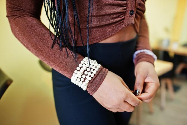
Consider using solid-colored accessories to act as visual “pauses.” A crisp white sneaker, a classic black belt, or a neutral-toned handbag can provide a calming element amidst the visual excitement of mixed prints. Alternatively, pick out a less dominant color from one of your prints and choose accessories in that shade. This creates a subtle echo, reinforcing the overall color story without introducing a new pattern.
Jewelry should generally be minimal and understated, allowing the prints to remain the star. Simple metallic pieces or delicate stud earrings are often preferable to bold, statement necklaces or chunky bracelets that might compete for attention. The goal is to enhance, not overwhelm, your carefully curated mixed-print ensemble.
Start Small: Dip Your Toes Into Print Mixing
If the idea of a full-blown mixed-print outfit still feels intimidating, begin by incorporating prints through smaller, less commitment-heavy items. This allows you to experiment and build comfort without feeling as though you’ve over-committed. Consider these entry points:
- Printed Scarves: A scarf is an excellent way to introduce a second pattern to a monochrome outfit or even to another print. It’s easily removable if you change your mind.
- Footwear: Floral sneakers, striped heels, or leopard print boots can add an unexpected twist to an otherwise solid-colored outfit, or complement a subtly patterned dress.
- Handbags: A handbag with a distinct print can act as a standalone statement piece or tie together colors from different elements of your clothing.
- Small Garments: Think printed socks peeking out, or a patterned pocket square for men. These subtle touches demonstrate an eye for detail without being visually overwhelming.
Starting small builds confidence incrementally. As you become more comfortable with these minor integrations, you’ll naturally feel more adventurous to combine larger, more prominent patterns, eventually reaching the point where mixed prints become second nature to your personal style.
Overcoming Common Pitfalls: What to Avoid
While mixing prints is an exciting fashion frontier, there are common missteps that can quickly derail an otherwise stylish attempt. Acknowledging these pitfalls is just as important as understanding the rules for success. By being aware of what to avoid, you can refine your approach and ensure your mixed-print ensembles are always chic, not chaotic. It’s about learning from potential mistakes before you make them, saving you from fashion regrets.
Many of these pitfalls stem from an imbalance—either too much going on, or elements that simply do not communicate well together. The goal is to achieve harmony, and knowing what disrupts that harmony is key to consistently nailing the mixed-print look.
Too Many Patterns: The Visual Overload
One of the most frequent mistakes in print mixing is simply using too many different patterns. While it might seem counter-intuitive, an outfit with an excessive number of distinct prints often looks busy, jarring, and difficult for the eye to process. The result is visual overload, where no single pattern gets a chance to shine, and the overall impression is one of disorganization rather than deliberate style.
As a general rule for beginners, aim for two to three prints at most. Often, two contrasting patterns are sufficient to create a dynamic and interesting look. If you introduce a third print, ensure it’s very subtle, perhaps a texture or a small, neutral print that acts as a bridge between the other two. Each pattern should serve a purpose and contribute to the overall aesthetic without fighting for dominance. When in doubt, simplify; less is often more impactful when dealing with multiple patterns.
Ignoring Color Cohesion: The Clashing Palette
While print scale and pattern type are important, ignoring color cohesion is perhaps the quickest way to create a disastrous mixed-print outfit. When prints are combined without any shared or complementary colors, the result is a clashing, disharmonious look that screams “fashion accident.” Even the most perfectly matched scales and pattern types will fail if the colors are fighting each other.
Always ensure there’s at least one common color across all the prints you’re combining. This could be a dominant hue, a mere accent color present in both, or a neutral that ties everything together. If your prints don’t share any colors, they need to be in the same color family (e.g., various shades of blue and green, or warm tones like reds and oranges) or be explicitly complementary colors that are known to work well together (e.g., navy and yellow). A lack of color cohesion makes an outfit feel unintentional and haphazard, undermining any attempt at stylish print mixing.
Similar Scales: The Muddled Effect
Another common pitfall is pairing prints that have very similar scales, especially when their patterns are also somewhat alike. When two patterns of roughly the same size are placed next to each other, they tend to “muddy” together visually. The eye struggles to differentiate between them, leading to a blurry, undefined look rather than a clear and impactful statement.
The beauty of print mixing often lies in the contrast of scales. A large, bold floral next to a delicate pinstripe creates visual interest because each pattern is distinct. If both the floral and the pinstripe were of similar medium scale, they might merge into an indistinguishable texture from a distance. Always aim for a noticeable difference in scale between your chosen prints. This ensures that each pattern has its moment, contributing to a dynamic and well-defined ensemble without becoming visually overwhelming or confusing.
Maintaining Confidence and Originality
The journey to mastering print mixing is as much about cultivating confidence as it is about understanding fashion principles. True style stems from an inner conviction that allows you to wear bold choices with ease and flair. Originality, on the other hand, comes from personal interpretation and a willingness to deviate from the norm. Together, confidence and originality transform mere clothing into a powerful statement of self-expression, elevating your print-mixing game from simple technique to an art form.
It’s about trusting your instincts and understanding that fashion is a playground, not a battlefield of rules. When you embrace your unique vision, even a seemingly unconventional pairing can become a signature look.
Embrace Your Personal Style: The Ultimate Rule
Ultimately, the most important rule in print mixing—and indeed, in all fashion—is to embrace your personal style. While guidelines exist to help you navigate, they serve as a starting point, not an unbreakable dogma. If a print combination feels authentic to you, if it brings you joy and confidence, then it’s the right combination. Over-analysis or strict adherence to rules can stifle creativity and make fashion feel like a chore rather than a form of self-expression.
Experimentation is key. Try on different combinations in front of a mirror. Take pictures to see how they look from various angles. Pay attention to how certain pairings make you feel. Do you feel empowered? Playful? Sophisticated? Your emotional response to an outfit is a powerful indicator of its success. Don’t be afraid to break a “rule” if the result truly embodies your aesthetic. Fashion is subjective, and what works for one person might not work for another. The most stylish people are those who dress for themselves, radiating an effortless confidence that comes from genuine self-acceptance and a clear understanding of their unique sartorial voice.
Practice Makes Perfect: The Experimentation Process
Like any skill, mastering print mixing requires practice and a willingness to experiment. You won’t get every combination right on the first try, and that’s perfectly fine. Fashion is a journey of discovery, and each new pairing—successful or not—offers a valuable learning opportunity. Think of your wardrobe as a canvas and your patterns as paints; the more you mix and match, the better you become at creating your personal masterpiece.
Start by pairing items you already own. Begin with simpler combinations and gradually challenge yourself with bolder patterns or more contrasting elements. Keep an eye out for inspiration—fashion magazines, style blogs, street style photography—but always adapt what you see to your own closet and comfort zone. Document your favorite combinations, either mentally or through photos, to build a repertoire of go-to looks. The more you practice and experiment, the more intuitive print mixing will become, transforming a once daunting task into a source of creative joy and endless possibility. Confidence isn’t just about wearing what you love; it’s about the courage to discover what that truly means for you.
| Key Principle | Brief Description |
|---|---|
| ✨ Vary Scale | Combine small, medium, and large prints for visual interest and balance. |
| 🌈 Color Cohesion | Unite patterns by sharing a common color or existing in a complementary palette. |
| textures | Use different fabric textures to add depth and bridge various prints. |
| 🧘♀️ Build Confidence | Start with subtle accents and gradually experiment with bolder print combinations. |
Frequently Asked Questions About Mixing Prints
Yes, absolutely! While two prints are a great starting point, advanced stylists often mix three or even four. The key lies in strategic layering, ensuring color cohesion, varying scale dramatically, and incorporating solid neutral pieces to provide visual breaks. It requires a keen eye and practice, but it’s certainly achievable for a high-fashion look.
For beginners, the simplest approach is to combine a classic print like stripes or polka dots with another, more organic print like florals, ensuring they share a common color. Alternatively, start with accessories: a printed scarf with a striped top or patterned shoes with a patterned dress. This allows you to dip your toes in without full commitment.
Color is your most powerful unifying tool. Look for prints that share at least one color, or have complementary hues within their palettes. For instance, if you’re mixing a red floral with a striped print, ensure the stripes have a touch of red, or choose black and white stripes to act as a neutral backdrop. Consistency in color family makes it feel intentional.
There are no absolute “never mix” rules in fashion, as personal style and context play a huge role. However, it’s generally challenging to successfully mix two very busy, similarly scaled, and highly contrasting prints without a unifying element. For example, two clashing, bold geometric prints of the same size might overwhelm. Focus on balance and harmony rather than strict avoidance.
Yes, mixing animal prints can be incredibly chic! The trick is to treat them almost as neutrals due to their earthy color palettes. Combine, for example, a leopard print with a snake print by ensuring they share similar underlying tones (e.g., both warm browns or cool grays). Varying the scale of the patterns also helps prevent them from clashing.
Conclusion
Mastering the art of mixing prints is a transformative skill that elevates your wardrobe from predictable to powerfully personal. It’s a journey that begins with understanding fundamental principles like scale and color harmony, progresses through playful experimentation with classic pairings, and culminates in the confident expression of your unique aesthetic. By embracing thoughtful accessorizing, learning from potential pitfalls, and trusting your instincts, you can confidently combine patterns, transcending mere fashion rules to create outfits that are bold, stylish, and unmistakably your own. Each mixed-print ensemble becomes a creative statement, showcasing not just your sartorial prowess, but your fearless approach to personal expression.
