Color Psychology in Style: Influence Mood & Perception
The power of color psychology in style choices enables individuals to consciously influence their own mood and the perceptions of others, leveraging the inherent emotional and psychological associations that different hues evoke.
Have you ever noticed how certain colors instantly shift your mood or change how you perceive a person? This isn’t mere coincidence. The profound impact of hues on human psychology is a fascinating field, and understanding The Power of Color Psychology: Use Color to Influence Mood and Perception in Your Style Choices can transform not just your wardrobe, but also how you navigate the world. By consciously selecting colors, you gain a powerful tool to express yourself, manage your emotions, and shape first impressions.
The foundational principles of color psychology
Color psychology delves into the intricate relationship between colors and human behavior, emotions, and perceptions. It’s a field rooted in both scientific observation and cultural associations, revealing how different hues can evoke specific feelings, influence decisions, and even alter physiological responses. Historically, cultures worldwide have attributed various meanings to colors, shaping their collective unconscious associations.
For instance, warm colors like red and orange are often linked to energy and passion, while cool colors such as blue and green tend to evoke calmness and stability. Understanding these fundamental principles is the first step in harnessing color’s potential in personal style. It’s not just about what looks good, but what a color communicates, both to you and to those around you.
Understanding color temperature: warm vs. cool
Color temperature is a critical aspect when applying psychological principles to style. Warm colors, encompassing reds, oranges, and yellows, are generally perceived as energetic, stimulating, and passionate. They tend to draw attention and can make elements appear closer or larger. Conversely, cool colors, including blues, greens, and purples, usually evoke feelings of calm, sophistication, and serenity. They can make spaces or objects seem more expansive and are often associated with introspection.
- Warm colors: Energize, excite, and command attention. Think of a power outfit in a bold red.
- Cool colors: Soothe, relax, and convey stability. A soft blue shirt might project trustworthiness.
- Neutral colors: Provide balance and versatility, serving as a canvas for other hues. Greys, blacks, whites, and browns can be grounding.
The strategic use of color temperature in your wardrobe allows you to manipulate how you are perceived. Wearing warm tones can convey confidence and dynamism, while cool tones might suggest reliability and approachability. This nuanced understanding enables a more purposeful approach to dressing.
The role of cultural context and personal association
While some color associations are universal, many are deeply tied to cultural contexts. For example, white is associated with purity and weddings in Western cultures, but with mourning in some Eastern traditions. Similarly, black can signify elegance in one context and sorrow in another. Personal experiences also play a significant role; a color linked to a positive memory for an individual will evoke a different emotional response than one tied to a negative event. Therefore, while general principles are useful, always consider the specific audience and your own connection to a color.
In essence, color psychology isn’t a rigid science but a dynamic interplay of universal tendencies, cultural norms, and individual life experiences. For personal style, this means that while a vibrant yellow generally signifies cheerfulness, its exact impact can vary. Adapting these principles to your context ensures a more effective and authentic application of color in your daily wear.
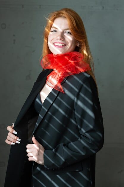
Red: the color of power and passion
Red is undoubtedly one of the most primal and potent colors in the spectrum, universally recognized for its immediate and intense impact. It’s the color of fire and blood, evoking strong emotions and associations across cultures. In color psychology, red is linked to energy, passion, desire, and strong emotions. It has a significant physiological effect, known to increase heart rate and stimulate adrenaline, making it a color that commands attention and action.
When incorporated into style, red is a statement. It communicates confidence, leadership, and a willingness to stand out. Wearing red can make you feel more assertive and powerful, a feeling that often translates into how others perceive you. This makes it an ideal choice for situations where you want to project strength and determination, such as business negotiations or public speaking engagements.
Using red for impact and confidence
The strategic deployment of red in your wardrobe can significantly boost your presence. A full red outfit, while bold, can signify absolute self-assurance and unapologetic power. For those who prefer a more subtle approach, incorporating red as an accent can still deliver a powerful message without overwhelming. A red accessory, like a tie, a pair of shoes, or a handbag, can draw attention to a specific part of your ensemble and inject a dynamic energy. This allows for a touch of vibrancy and confidence in controlled doses.
However, it is crucial to use red judiciously. Excessive use can sometimes be perceived as aggressive or overly dominant, depending on the context. Moderation, or pairing red with more neutral tones, can help balance its intensity, making your statement assertive yet approachable. Think of a crisp white shirt under a red blazer, or a muted grey suit with a vibrant red pocket square. These combinations leverage red’s power without making it overwhelming.
Red for special occasions vs. daily wear
The versatility of red allows it to be adapted for various settings, though its intensity often dictates its most appropriate use. For special occasions where you want to make a memorable entrance, a sophisticated red gown or a sharp red tuxedo can be undeniably striking. It suggests glamour, confidence, and a touch of daring. In such scenarios, red amplifies your presence, ensuring you are noticed and remembered. It’s a celebratory color that reflects excitement and joy, perfect for festive gatherings or formal events.
For daily wear, the approach to red might be more tempered. While a vibrant red scarf or a pair of red sneakers can inject personality into an everyday outfit, a full red ensemble might be too much for a typical workday in a conservative environment. Here, red can be used strategically in smaller doses. A red lip, a red watch, or even red stitching on an otherwise neutral piece of clothing can subtly hint at passion and energy without being overly conspicuous. This allows you to harness red’s psychological benefits in a way that aligns with the nuances of daily life, reflecting a balanced approach to its powerful implications.
Blue: the essence of trust and tranquility
Blue is consistently ranked as humanity’s favorite color, and its widespread appeal is largely due to its psychological associations with serenity, stability, and trust. Unlike the stimulating nature of red, blue is known for its calming effect. It evokes images of tranquil oceans and vast skies, promoting feelings of peace, order, and security. In professional settings, blue is often chosen for its ability to project reliability and expertise, making it a staple in corporate wardrobes. It’s a color that communicates seriousness and commitment without being overly aggressive.
The versatility of blue spans a wide spectrum, from deep navy, which exudes authority and sophistication, to light sky blue, which conveys approachability and freshness. This range allows individuals to tailor their message more precisely through varying shades. Whether it’s a critical business meeting or a casual social gathering, blue offers a diverse palette to effectively communicate your intended persona.
Shades of blue and their influence
The nuances within the blue spectrum offer distinct psychological impacts, each suited for different stylistic intentions. Navy blue, for instance, is highly regarded for its professionalism and authority. Often seen in business suits and uniforms, it signals competence, trustworthiness, and a timeless elegance. Wearing navy can help establish credibility and a serious demeanor. Royal blue, on the other hand, is a more vibrant and energetic shade. It suggests confidence, creativity, and a touch of regal flair, making it suitable for situations where you want to be noticed but still convey reliability.
Moving towards lighter shades, sky blue and powder blue evoke feelings of calmness, openness, and friendliness. These softer blues are excellent for fostering an approachable and relaxed atmosphere. They can make you appear less intimidating and more communicative, ideal for casual Fridays or social events where a more laid-back yet polished image is desired. The deliberate selection of a specific blue shade can significantly refine the message you wish to convey through your style.
- Navy blue: Authority, professionalism, timelessness. Ideal for business.
- Royal blue: Confidence, creativity, subtle vibrancy. Good for networking.
- Light blue/Sky blue: Calmness, approachability, freshness. Suitable for casual or informal meetings.

These distinct psychological effects rooted in different shades of blue allow for a rich toolkit when consciously curating personal style. Understanding these variations empowers you to select the precise tone that best supports your communication goals and strengthens your desired projection.
Incorporating blue for professionalism and approachability
The strategic integration of blue into your style repertoire offers a dual benefit: enhancing both professionalism and approachability. For a strong professional presence, incorporating navy or darker blues into your attire, such as a well-tailored suit or a structured blazer, immediately conveys authority and trustworthiness. These shades are particularly effective in corporate environments where reliability is paramount. The stability inherent in blue helps to project an image of composure and competence, which is crucial for leadership roles or client-facing interactions.
Conversely, to harness blue for approachability, shifting to lighter shades can be highly effective. A sky-blue shirt, a light-wash denim jacket, or even a pastel blue accessory can soften your overall look, making you seem more open and friendly. This is especially useful in collaborative settings, team meetings, or social gatherings where fostering connection is key. The calming influence of lighter blues can put others at ease, facilitating more natural and comfortable interactions. By consciously selecting the depth and intensity of blue, you can fine-tune the perceptions you wish to create, navigating the balance between authority and warmth with precision.
Yellow and Green: optimism, creativity, and harmony
Yellow and green, neighboring colors on the spectrum, both possess unique psychological attributes that can profoundly influence mood and perception. Yellow is the color of sunshine, universally associated with optimism, happiness, and energy. It is a stimulating color that can evoke feelings of cheerfulness and creativity. In style, wearing yellow can suggest an open, positive personality and a sense of innovation. However, an excess of bright yellow can sometimes be overwhelming or signal anxiety, so balance is key.
Green, the color of nature, is strongly linked to harmony, growth, balance, and tranquility. It is refreshing and calming, often promoting feelings of peace and security. From a psychological standpoint, green can alleviate anxiety and promote well-being, making it a comforting choice. In fashion, green conveys a sense of environmental consciousness, health, and stability. Both colors offer rich potential for expressing a dynamic and positive persona.
Yellow for energy and attention
Using yellow in your style can be a powerful way to inject energy and draw positive attention. A bright yellow dress or a bold yellow top can immediately brighten a room and signal enthusiasm. Yellow is particularly effective for creative fields or social gatherings where you want to project a lively and approachable persona. It communicates optimism and a readiness for new ideas. For those who prefer a more subtle approach, a splash of yellow in an accessory – a scarf, a pair of earrings, or a statement necklace – can provide a pop of cheerfulness without dominating the entire outfit. This allows you to harness yellow’s positive energy in a controlled and deliberate manner.
However, it’s worth noting that pure, saturated yellow can be quite intense. For a softer effect, consider mustard yellow or a pale lemon shade, which still carry the positive associations of yellow but with less visual impact. These muted tones can be exceptionally chic and versatile, suitable for both casual and more formal settings. The key is to select a shade of yellow that resonates with your personal energy and the message you wish to convey, ensuring it enhances rather than overwhelms your overall look.
Green for balance and growth
Green offers a refreshing alternative among colors, particularly for those seeking to project balance, harmony, and growth. Its strong ties to nature make it inherently soothing and restorative, often promoting a sense of well-being and stability. In terms of style, wearing green can signal a grounded, balanced personality and an appreciation for calmness. It’s an excellent choice for environments where fostering collaboration and a sense of community is important, as it subtly communicates reliability and approachability.
Different shades of green carry distinct connotations. A deep forest green can convey sophistication and tradition, often seen in classic ensembles, while a vibrant lime green suggests vitality and creativity, more suited for contemporary or artistic expressions. Olive green offers an earthy, understated elegance, perfect for a subtle yet refined look. Incorporating green through a tailored jacket, a flowing dress, or even a statement piece of jewelry can anchor your look in natural tranquility while promoting a sense of growth and renewal. Green’s versatility allows for personal expression across a spectrum of moods and occasions.
- Forest green: Sophistication, tradition, depth.
- Lime green: Vitality, creativity, youthfulness.
- Olive green: Earthiness, understated elegance, natural grounding.
Choosing the right shade of green allows you to fine-tune the psychological message, whether it’s a desire for serenity, a statement of vibrancy, or a connection to natural elements. It’s a color that speaks of renewal and steady progress, making it a powerful tool in your stylistic arsenal.
Purple and Pink: creativity, luxury, and compassion
Purple and pink, though distinct, often share associations with imagination, emotion, and refined sensibilities. Purple, historically linked to royalty and spirituality, exudes an aura of luxury, mystery, and creativity. It’s a color that blends the calm stability of blue with the fiery energy of red, resulting in a hue that can be both calming and stimulating. In style, donning purple can signify sophistication, ambition, and a unique, artistic sensibility. It’s a color for those who wish to project individuality and a touch of grandeur.
Pink, traditionally associated with femininity and sweetness, has evolved to represent compassion, playfulness, and approachability. While lighter shades convey tenderness and innocence, bolder fuchsias can be vibrant and assertive, challenging traditional perceptions. Pink can foster a sense of warmth and understanding, making it an excellent choice for building rapport or expressing empathy. Together, these colors offer a rich palette for nuanced self-expression in personal style.
Purple for sophistication and mystique
Incorporating purple into your style instantly elevates your look, lending it an air of sophistication and a hint of mystique. Darker shades like deep plum or aubergine are particularly effective for formal wear, conveying a sense of luxury and depth. They are excellent choices for evening dresses, tailored suits, or statement accessories for a touch of refined elegance. These rich tones suggest discernment and a discerning taste, making them suitable for high-stakes meetings or exclusive events where you want to project an image of distinguished authority.
Lighter purples, such as lavender or lilac, offer a softer, more whimsical feel. These pastels are ideal for daytime wear, suggesting creativity and a gentle, romantic sensibility. They can be incredibly refreshing for spring and summer outfits, adding a touch of charm and approachability without losing the inherent sophistication of purple. Whether a monochromatic purple ensemble or a subtle accent, this color empowers you to communicate uniqueness and an artistic flair. The versatility of purple allows you to convey different facets of your personality, from regal power to gentle imagination.
Pink for approachability and warmth
Pink, often underestimated in its psychological depth, is a remarkably versatile color for conveying approachability and warmth. Beyond its traditional associations, pink can project a sense of compassion, gentleness, and non-threatening appeal. Lighter shades like blush or rose quartz are perfect for creating an inviting and soft aesthetic, ideal for environments where you want to foster trust and open communication. A soft pink sweater or blouse can make you appear more open and understanding, encouraging positive interactions.
For those seeking a bolder statement while retaining warmth, vibrant fuchsia or magenta can be incredibly impactful. These brighter pinks suggest confidence, energy, and a playful spirit without sacrificing approachability. They are excellent for creative settings, social events, or even as a pop of unexpected color in a professional outfit. Pink ties, scarves, or even a statement piece of jewelry can add a personal touch of warmth and optimism to an otherwise neutral ensemble. By strategically selecting the shade and intensity of pink, you can curate an image that is both engaging and empathetic, inviting connection and rapport.
Neutrals: the foundation of versatile style
While vibrant colors grab immediate attention, neutrals—including black, white, grey, beige, and brown—form the bedrock of a versatile and intentional wardrobe. Far from being merely “background” colors, neutrals possess their own distinct psychological impacts and serve as essential tools for balancing, grounding, and elevating an outfit. They provide a sophisticated canvas upon which other colors can truly shine, or they can stand alone, making powerful statements of their own. Understanding the nuances of each neutral allows for strategic use in creating a cohesive and impactful personal style.
Neutrals are praised for their timelessness and adaptability. They transcend trends and seasons, making them smart investments for any wardrobe. Their ability to pair seamlessly with virtually any other color makes them indispensable for building a truly functional and expressive collection of clothes. Moreover, the psychological message conveyed by neutrals is one of stability, professionalism, and understated elegance, qualities highly valued in many social and professional contexts.
Black for sophistication and authority
Black holds a unique position among colors, symbolizing sophistication, power, and authority. It is often associated with formality, elegance, and a sense of mystery. In many cultures, black signifies seriousness and control, making it a popular choice for professional attire, evening wear, and ceremonial outfits. Wearing black can make you appear more slender, assertive, and decisive. It communicates a strong, uncompromising presence and a sense of gravitas, which is why it’s a go-to for leaders and those in positions of influence.
While monochromatic black outfits exude undeniable chicness, they can sometimes appear unapproachable or overly severe. To soften black’s intensity, consider pairing it with textured fabrics, luxurious materials like silk or velvet, or adding pops of color through accessories. A black pant suit with a vibrant scarf, or a black dress with bold statement jewelry, can maintain sophistication while injecting personality. Black’s versatility means it can be adapted for almost any occasion, from the most formal events to stylish everyday looks, always conveying a sense of refined power.
White for purity and clarity
White is the embodiment of purity, clarity, and new beginnings. Psychologically, it evokes feelings of freshness, cleanliness, and innocence. In fashion, white is synonymous with crispness, simplicity, and elegance. It reflects light, making spaces and individuals appear brighter and more open. Wearing white can convey honesty, transparency, and a minimalist aesthetic. It’s often chosen for summer attire due to its cooling properties and its ability to project a light, airy presence, making it ideal for creating an impression of serenity and calm.
While often seen as a backdrop, white can also be a powerful statement color on its own. A monochromatic white outfit, especially in structured fabrics, exudes confidence and high fashion. Layering different shades of white and off-white can add depth and texture to an otherwise simple ensemble. White also serves as an excellent base for vibrant accessories, allowing them to pop. Its inherent simplicity ensures that the focus remains on the wearer, projecting an aura of freshness and clear-headedness, making it a timeless and essential component of any curated wardrobe.
Grey, beige, and brown for balance and timeless appeal
Grey, beige, and brown are the unsung heroes of a versatile wardrobe, offering balance, timeless appeal, and an understated sophistication. Grey, a composite of black and white, signifies neutrality, balance, and professionalism. It’s a diplomatic color that can convey stability and logic without the starkness of black or white. Different shades of grey, from charcoal to dove grey, can create diverse moods, from serious business to relaxed casual. It pairs beautifully with almost any color, diffusing their intensity and allowing them to stand out.
Beige and various shades of tan symbolize warmth, reliability, and conservative elegance. They are grounded colors that evoke a sense of calm and natural comfort. Beige is excellent for creating soft, harmonious looks, often associated with classic, accessible style. It’s less formal than grey but still conveys a refined sensibility, making it perfect for smart-casual and everyday wear. When combined with other neutrals, beige can create a rich, textured palette that is both inviting and incredibly chic.
Finally, brown, another earthy tone, represents stability, warmth, and resilience. It’s reminiscent of wood and soil, fostering feelings of security and groundedness. Brown can be incredibly rich and sophisticated, especially in shades like chocolate or cognac. It offers a warm alternative to black and grey, particularly in accessories like leather bags and shoes, and is excellent for conveying a friendly yet authoritative demeanor. These three neutrals collectively provide a sophisticated and adaptable foundation for any wardrobe, allowing for endless combinations and expressions of personal style with an enduring appeal.
| Key Point | Brief Description |
|---|---|
| ❤️ Red: Power & Passion | Evokes strong emotions, commands attention, and signals confidence. Use for impact. |
| 💙 Blue: Trust & Tranquility | Promotes calm, projects reliability, and establishes professionalism. Versatile for many settings. |
| 💛 Green: Harmony & Growth | Associated with optimism, nature, and well-being. Adds freshness and balance to style. |
| 🖤 Neutrals: Foundation & Balance | Black, white, grey, beige, brown offer sophistication, versatility, and groundedness. |
Frequently asked questions about color psychology in style
Begin by observing your current wardrobe and identifying the dominant colors. Then, select one or two specific colors you wish to incorporate based on the mood or message you want to project. Start with accessories like scarves, ties, or jewelry, and gradually move towards bolder pieces like a blazer or a dress as you become more comfortable. Pay attention to how different colors make you feel and how others react.
There are no universally “bad” colors. However, some colors might be less effective for certain situations or personal goals. For example, wearing overly bright or distracting colors in a very formal or conservative setting might be a poor choice. It’s more about context and the intensity of the color. Understanding your desired impact will guide you on what to avoid or minimize in specific instances.
Cultural context significantly shapes color interpretation. While red implies passion in many Western cultures, it signifies good luck in parts of Asia. White is for weddings in the West, but for mourning in some Eastern traditions. It’s crucial to be aware of the cultural context of your audience or environment when making color choices to avoid miscommunication, especially in international settings or diverse social groups.
Absolutely. The impact of color psychology is bidirectional. The colors you wear can trigger psychological responses within you. For instance, wearing vibrant yellow might elevate your spirits and make you feel more energetic, while a soft blue could induce a sense of calm and focus. This phenomenon is often rooted in personal associations and the universal psychological impacts of certain hues on the human brain and emotions.
Neutral colors (black, white, grey, beige, brown) are fundamental. They provide balance, sophistication, and versatility. Black conveys power; white, purity; grey, professionalism; and beige/brown, warmth. They act as a grounding force, allowing bolder colors to pop, or can stand alone for an elegant, timeless look. Neutrals are essential for building a cohesive and adaptable wardrobe that can be easily accessorized with pops of color.
Conclusion
The intricate world of color psychology offers a powerful, often overlooked, dimension to personal style. Moving beyond mere aesthetics, conscious color choices become a dynamic tool for self-expression and strategic communication. From the fiery passion of red to the serene trustworthiness of blue, and the grounding elegance of neutrals, each hue in your wardrobe carries a silent yet potent message. By thoughtfully selecting colors, you not only influence your personal mood and confidence but also subtly shape the perceptions of those around you. Embracing this knowledge transforms dressing from a routine into an art, allowing you to curate an image that is both authentic and impactful, perpetually influencing your narrative.


